Fresenius
ux design // prototyping // user research
Fresenius Kidney Care set out to redesign PatientHub's therapy flowsheet, replacing a paper-based experience that was difficult for dialysis patients to maintain and easy to lose track of. As the visual designer on the project, I redesigned the interface into a more intuitive digital experience, creating three interactive prototypes and conducting usability testing with dialysis patients to evaluate each approach.
Working closely with strategists, I synthesized participant feedback and iterated on the designs to improve clarity, navigation, and overall usability before finalizing the recommended direction.
Introduces more visual input methods, including sliders, selectable buttons, and progress cues, to create a more guided, task-based experience.
CONCEPT R
Guided Inputs
Uses a more traditional, linear form structure to keep information visible while incorporating contextual guidance and alerts.
CONCEPT P
Continuous Form
CONCEPT O
Modular / Accordion
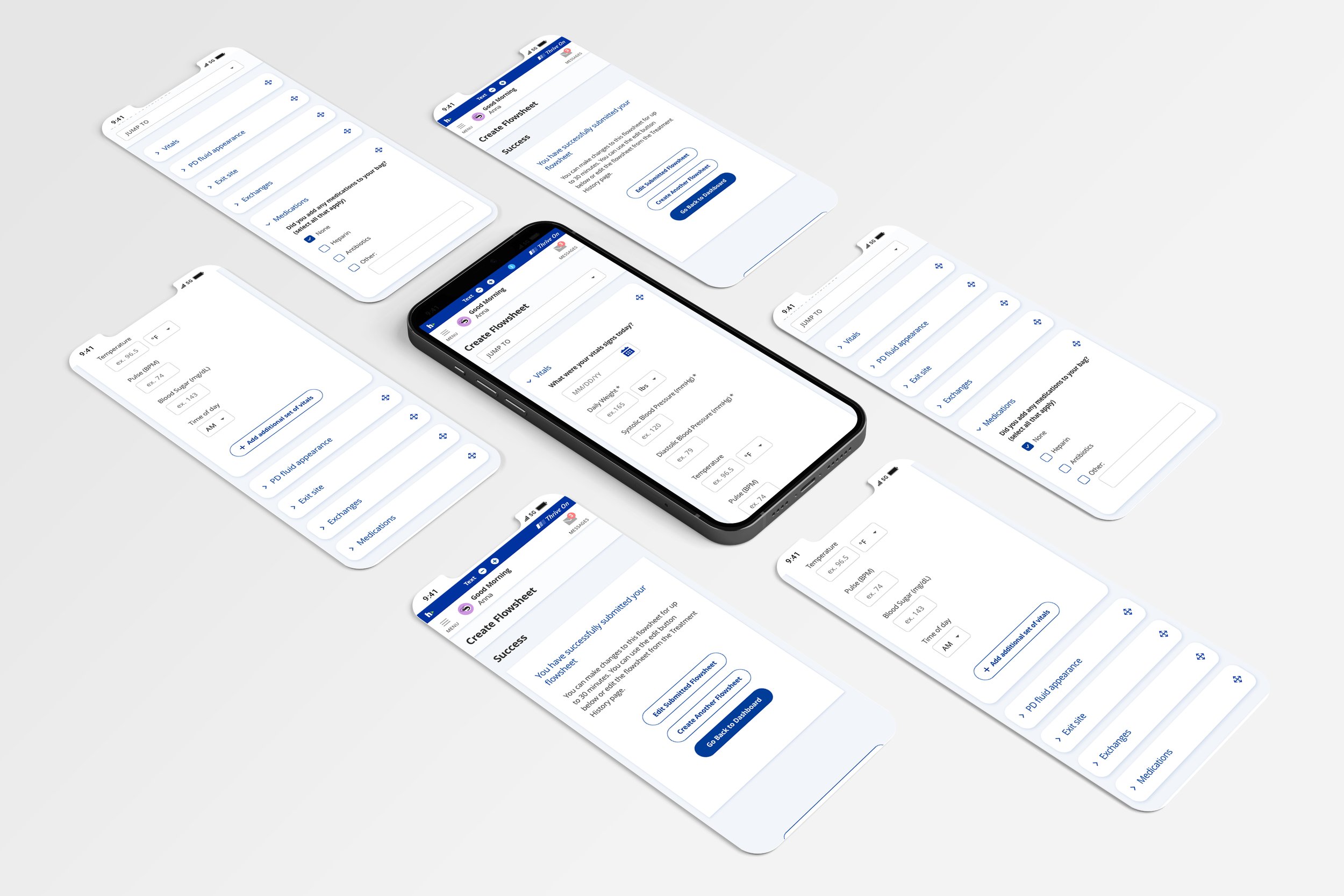
Organizes the flowsheet into modular sections that patients can collapse as they finish and rearrange to fit their own routine, reducing visual overwhelm and letting them focus on one step at a time.
We tested all three concepts with older adults undergoing dialysis to see which felt clearest and easiest to navigate. Participants preferred Concept O, the modular accordion. Because patients complete the flowsheet every day, they valued collapsing sections as they finished them and arranging the sections in the order that suited them. The sliders in Concept R were hard to use: many participants had trouble seeing them as they moved, and they preferred typing numbers directly. The final design builds on Concept O, with the warning and guidance alerts from Concept P added in.
What We Learned