Boston Dynamics
information design // print
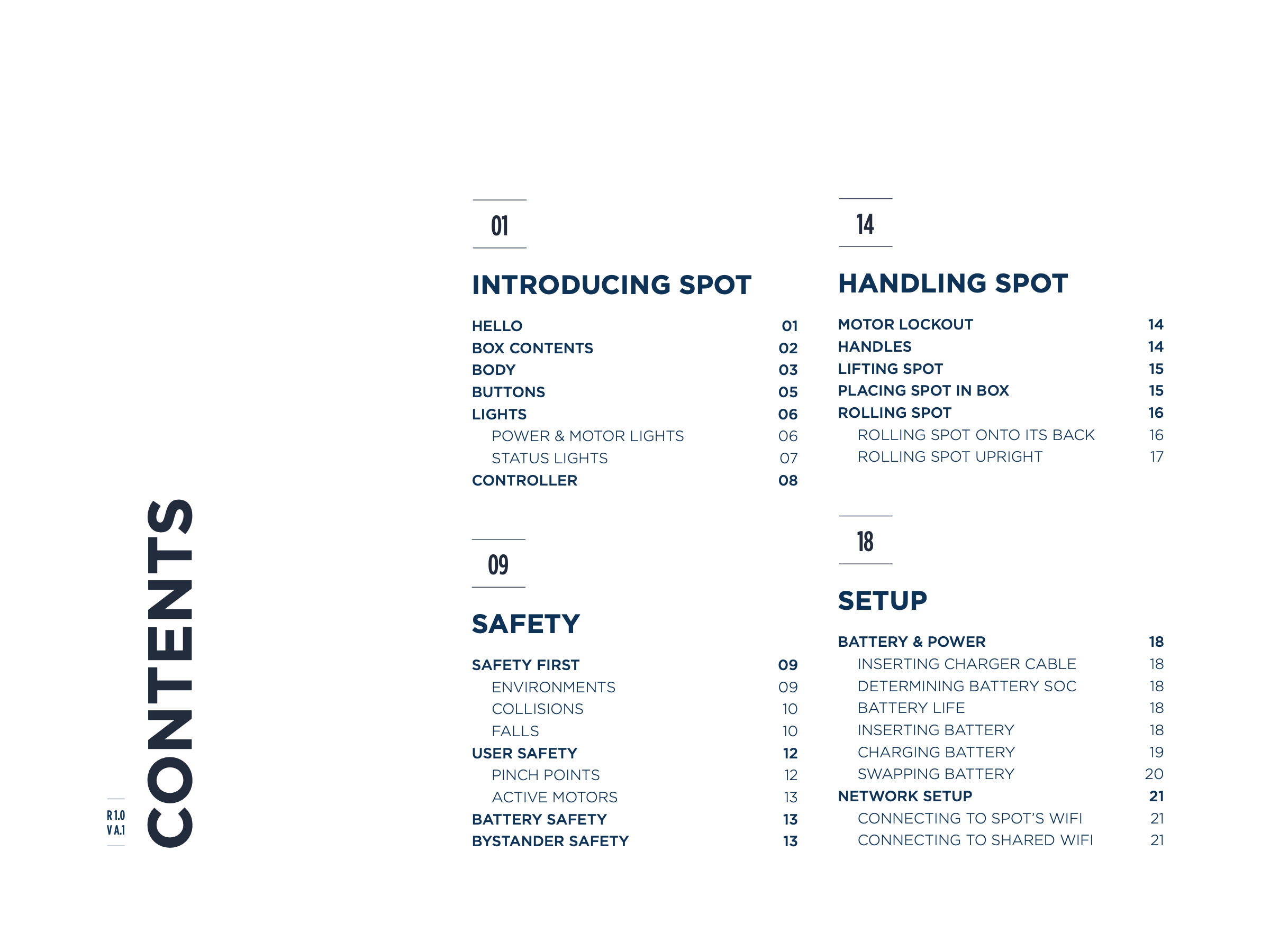
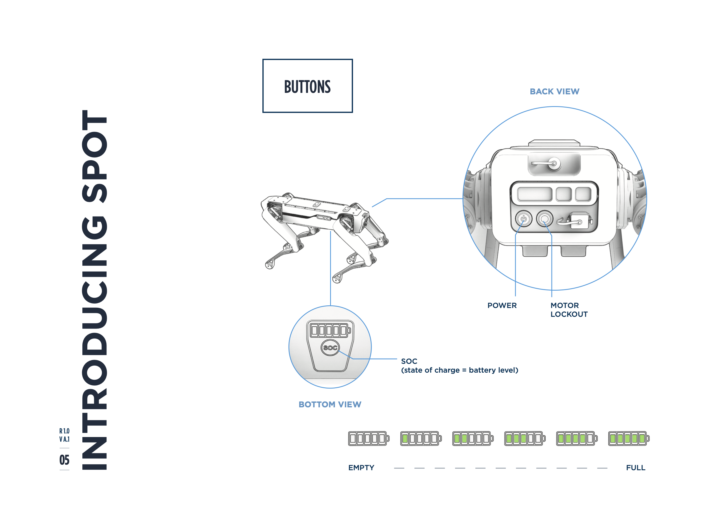
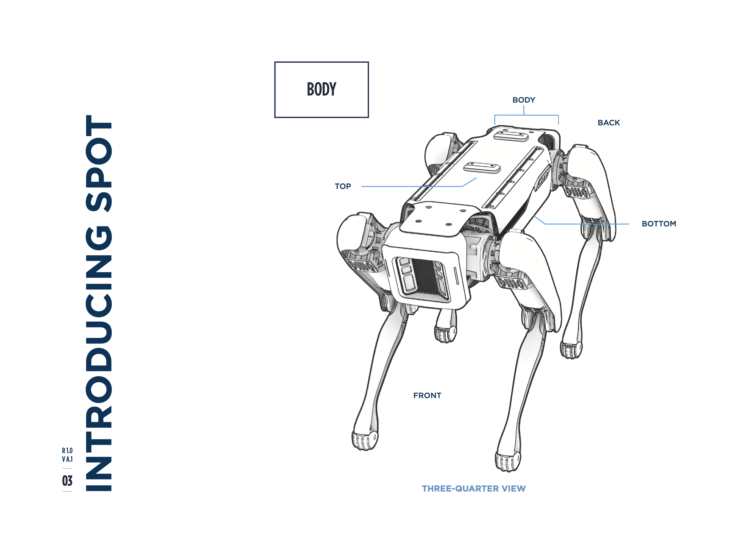
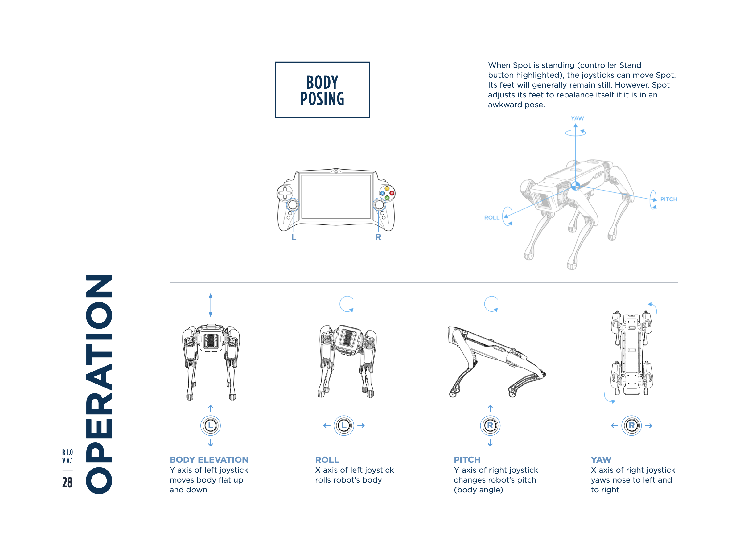
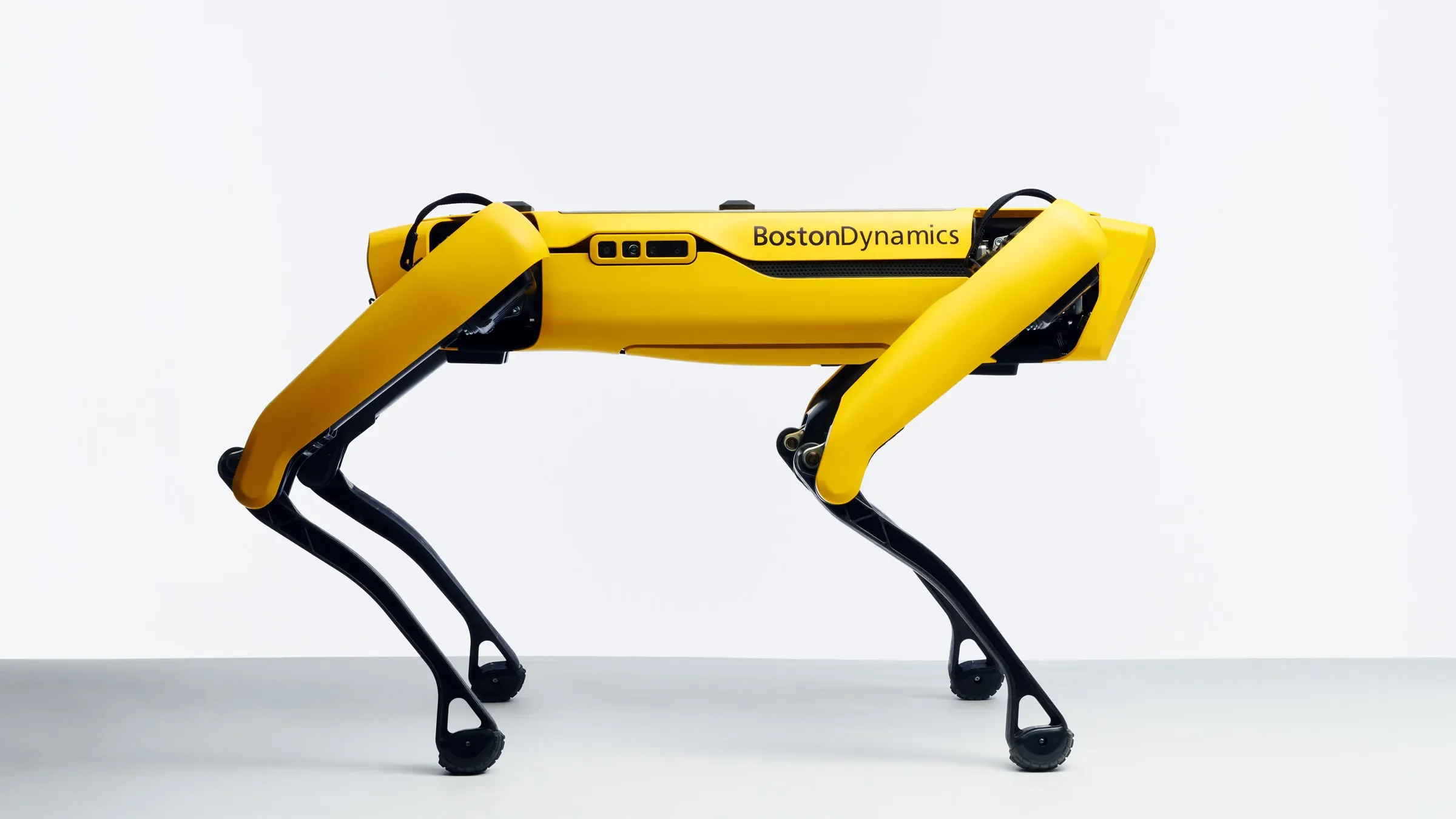
As Spot, Boston Dynamics' four-legged robot, moved into real-world use, the company needed an onboarding guide to help new operators learn handling, setup, safety, and autonomous operation. As project lead, I established the guide's visual language, led layout and art direction, and collaborated with an illustrator and copywriter to produce a 40-page manual.
With no established product brand system for Spot beyond the Boston Dynamics identity, I had to define what the guide could look and feel like while making complex technical and safety information clear and approachable.
View the full guide here

Early Explorations
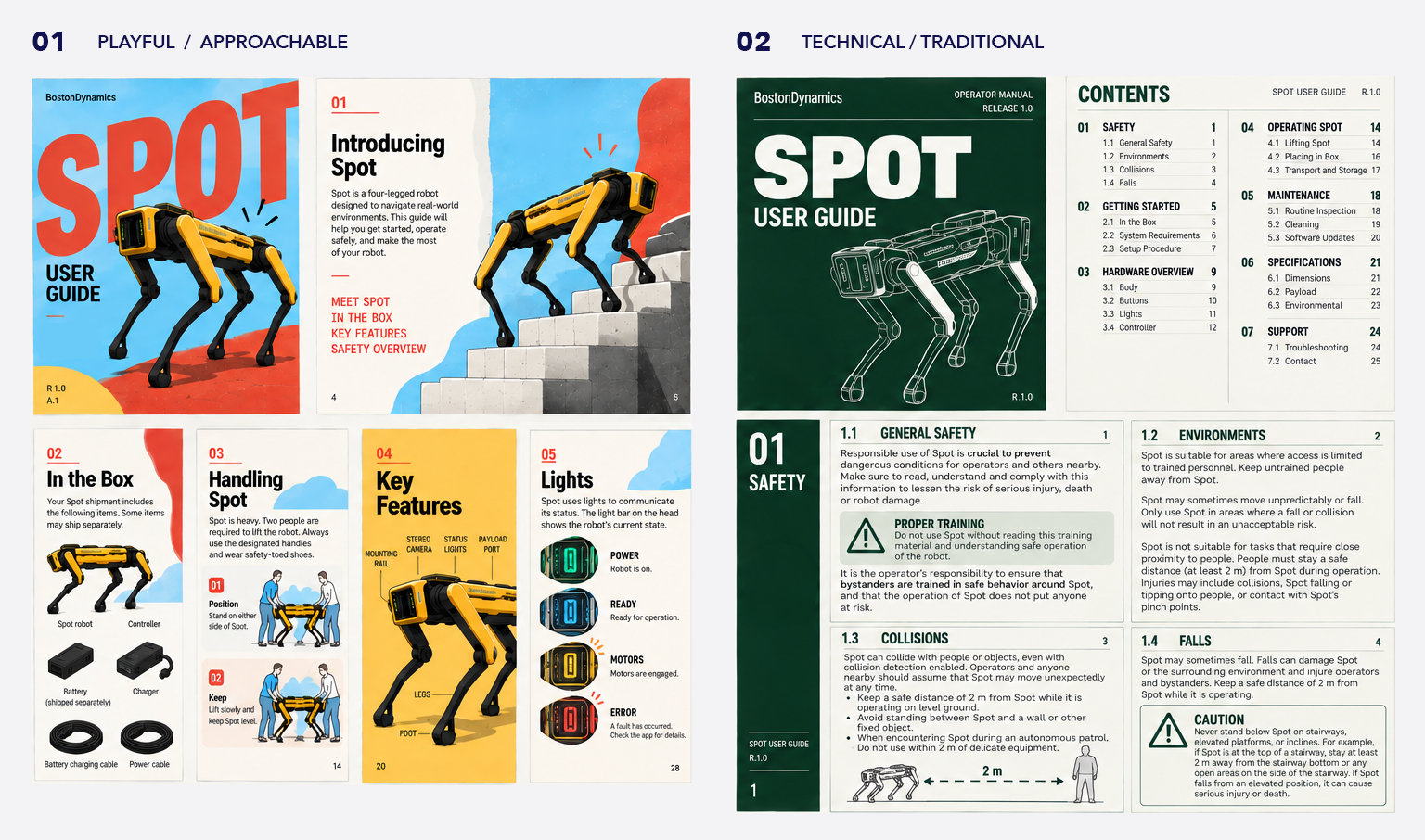
I explored two opposing directions for the guide. One was more expressive and approachable, leaning into Spot's personality through a brighter, more playful visual language. The other borrowed from traditional equipment manuals, prioritizing clarity, information density, and completeness.
Neither felt quite right on its own. Spot was approachable and unconventional, but operating it involved real hazards that needed to be communicated clearly.
Finding the Balance
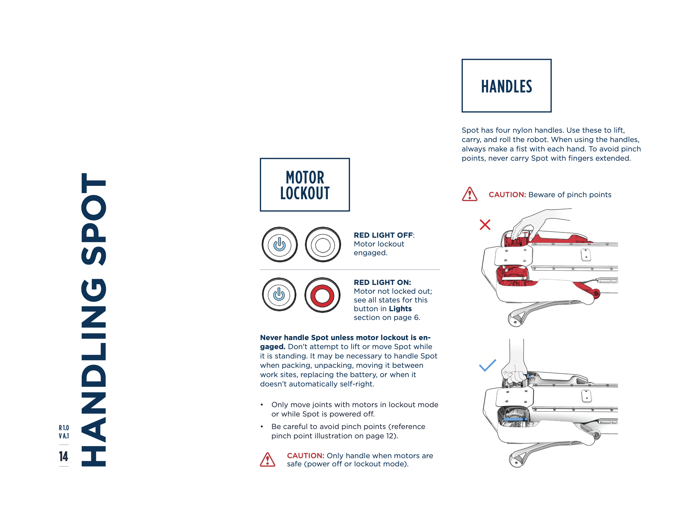
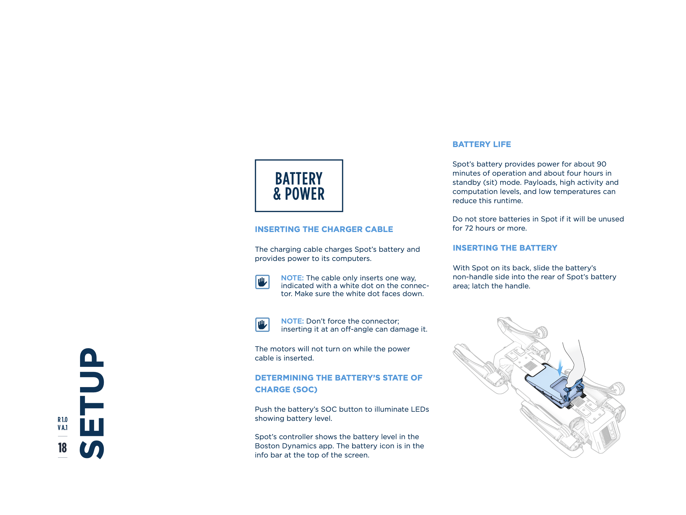
For the final direction, I wanted the guide to feel modern and approachable while still carrying the authority of a technical manual. I introduced more breathing room, a clear typographic hierarchy, and a modular editorial structure that allowed illustrations, diagrams, and instructional sequences to do more of the communicating. A restrained navy-and-cyan palette kept the system cohesive, while red was reserved for caution and safety.